
When clutter got purpose: Understanding the role of cultural context in UX/UI
When I visit Japan, I am always impressed by the density of information everywhere. Ads fill public spaces, train maps meticulously detail every route, and Japanese TV shows are layered with texts, colors, and effects. Even a simple pet bottle is packed with info, including a disclaimer that says, “the image used on the packaging is not real”.
Japanese UX/UI design follows a similar pattern, it often looks dense and might feel cluttered to your eye. However, it’s designed to be effective and people in Japan feel comfortable navigating through it.
Rebecca Rébillé - UX/UI Designer at Fujitsu
Why does this happen and where does it come from?
In this article, we will discover how culture impacts UX/UI with a focus on Japanese design.
Do you know about Ponchi-e?
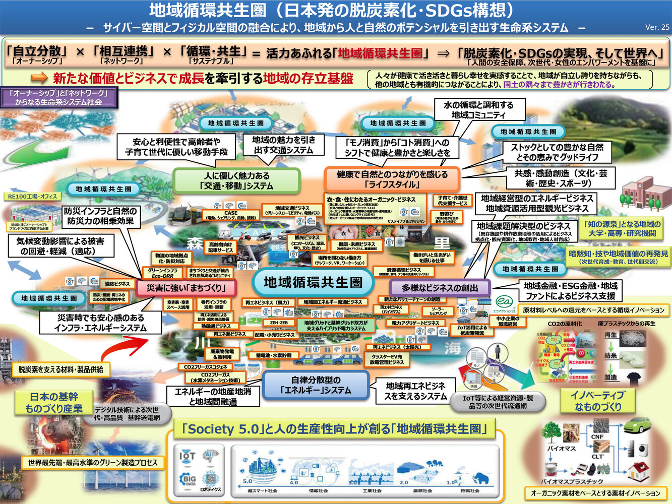
Before diving into UX/UI, let’s look at something called Ponchi-e (1), which you’ve probably come across if you work with a Japanese company. Starting as satirical cartoons in the Meiji period, and later influencing what we know as manga today, the term started referring in the 90’s to densely packed A4 layout Powerpoint slides used in Japanese government and business. These slides were made to fit all relevant details into one single page, making it easier for diverse stakeholders to understand the whole picture at a glance. Due to extensive review by coworkers and supervisors, Ponchi-e become more and more detailed. No white space goes to waste, every inch is filled with text, diagrams and arrows.
Though visually looking like information overload, it’s considered as a practical and familiar tool for sharing complex information. This approach of designing also appears in Japanese UX/UI, where information seems to take priority over style.
More information builds trust
In Japan, more information often means more trust. People feel more secure when they have all the details, which is a value deeply embedded in the culture. This preference is evident in various aspects, it’s part of everyday life. Take for example, the “pointing and calling” (shisa kanko) safety practice used by the railway operators in Japan. It requires them to say things out loud with hand gestures to prevent mistakes. I feel that the same idea can be applied to Japanese UX/UI, where important information is often emphasized using different signals. Layering texts, images, icons and colors, so that nothing is missed and to make sure users can quickly understand what they need to know.
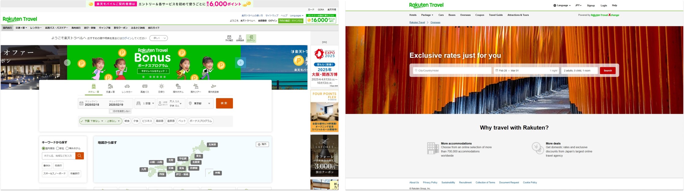
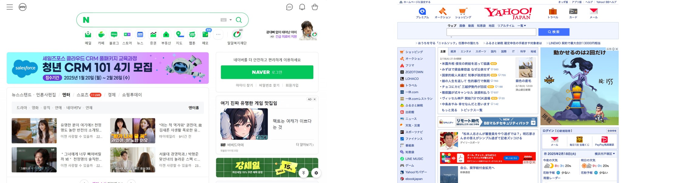
This approach is particularly evident when comparing how Japanese companies design their website to different group of users, showing clearly that the one for local Japanese customers is often denser than the one for global customers.
The role of cultural models
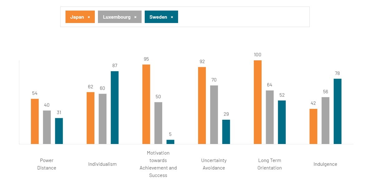
This ties into Hofstede’s cultural model (2), a widely used UX method that helps comparing the key tendencies between countries. For example, if we compare Japan and Luxembourg using this cultural model, we can see that uncertainty avoidance is higher in Japan. The difference is even more obvious, when compared to a Northwestern country like Sweden.
Interestingly, Riccardo Parenti, a UX Design Lead at Amazon Japan, observed that creating slightly more friction, such as extra steps during onboarding, makes Japanese customers feel more confident that they were doing things right. Beyond UX/UI, he also noted that uncertainty avoidance influences product adoption in Japan, explaining why designs that work are difficult to change unless there is clear evidence that the change will be successful or that there are no risks involved.
A culture that values context
To understand how people process information, it is also important to consider how people communicate with each other. This brings us to the concept of high-context communication versus low-context communication (3). In Japan, people are familiar with high-context communication: much of the information is understood through context rather than a more direct communication.
That can explain, why UX/UI in Japan often add many contextual elements that support users. Compared to that, Western designs tend to prefer a low-context communication which is object-focused, meaning that clarity and explicit instructions are prioritized.
High-context communication isn’t unique to Japan; it’s also common in many other Asian countries which could explain the similar approach to organize information.
Language and UX/UI structure
Language also plays a role in structuring information. Japanese writing relies on 3 different scripts -hiragana, katakana and kanji - and two types of reading as text can be written horizontally and vertically. In contrast, European languages follow a horizontal reading.
This flexibility in writing and reading patterns could also explain the holistic (4) approach that Japanese people tend to have while processing dense information. A good example of flexibility is the Japanese “Flick” keyboard which uses a system where each button holds multiple characters, relying on predictive text to type quickly. This shows that clarity doesn’t necessarily come from simplicity but from familiarity.
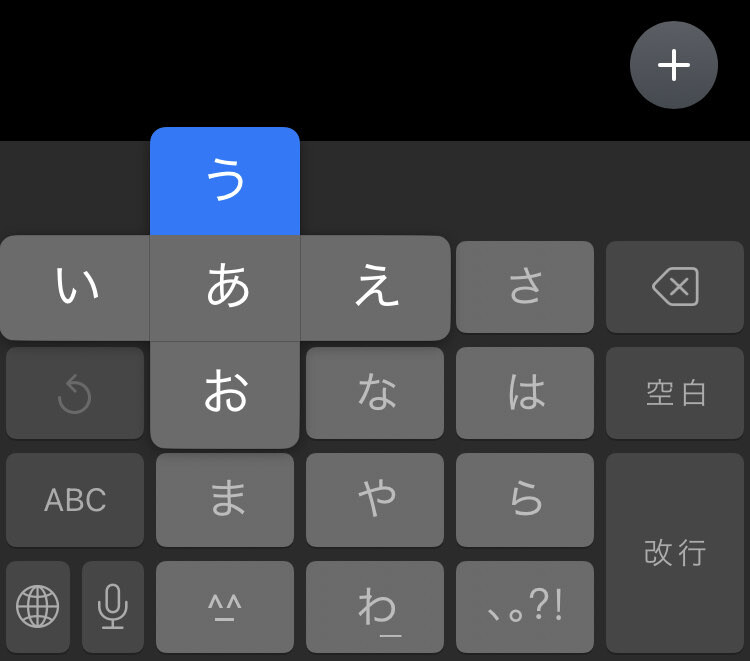
Flick keyboard is a 12 key layout for fast input with simple flick gestures.
How UX/UI evolves across cultures?
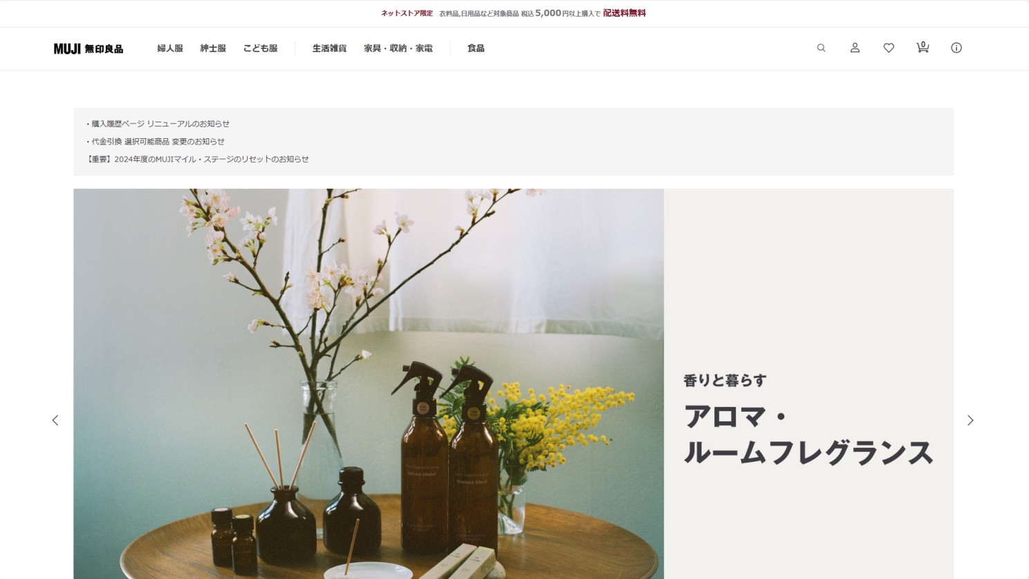
While Western design often prefers minimalism (Swiss design is a perfect example), we’ve seen that Japanese UX/UI leans towards comprehensive communication, prioritizing dense content over style. Nevertheless, this doesn’t mean, everything is cluttered; there are plenty of minimalist designs too. Especially since there's a whole history around Japanese minimalism, with the concept of wabi-sabi or what Sori Yanagi called “anonymous design”, a broader spectrum is to be discovered, of course. In the end, it all depends on what the product is meant to do, how users expect to interact with, and the brand’s identity. A banking app, for example might display structured and dense information to reassure users, while a meditation app would likely become minimal to create a calming experience.
Conclusion
This article certainly did not cover everything, since this topic is broad, and many factors are intertwined. However, I hope it has given you a glimpse into how culture influences UX/UI design, with Japanese design as an example. Good UX/UI is not just about being simple or complex, it’s about understanding users’ cultural backgrounds, psychology and values to align with their expectations. This is why, it is important to approach design with diverse perspectives and adapt it to make the product as global and accessible as possible for people. Multicultural design is both complex and fascinating!
In the next article, we will talk about accessibility giving also insights about why it’s crucial to continuously work with individuals across the world to ensure inclusive and ethical design.
An article written by Rebecca Rébillé
(1) Ponchi-e combines the words “punch”, pronounced as “ponchi” in Japanese, and “e” meaning “drawing”.
(2) The Hofstede cultural model is a widely used UX method, based on six dimensions of comparison. However, results should be considered as estimates, as some countries are more multicultural than others due to immigration. It is a great model for UX research when combined with other UX methods to analyze the target audience.
(3) The concepts of high context and low context communication were first introduced by the anthropologist Edward T. Hall.
(4) A holistic approach refers to a tendency to focus on relationships between objects and their contexts. A research paper on cognitive differences between Westerners and East Asians shows out that Westerners tend to have more analytical thinking which means that they focus more on objects independently whereas the holistic thinking is a more interdependent approach. (Source: The Origin of Cultural Differences in Cognition: The Social Orientation Hypothesis, 2010)
(5) The principle “Form follows function” was introduced in the late 19th, for architecture and industrial design, and later applied to software engineering and enterprise architecture. It is a principle to ensure that the design of the solution is determined by its function first.