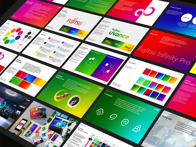
In October 2021, Fujitsu reviewed its brand identity (the elements that build the customers impression of a brand image) in order to realize our company’s purpose. In recognition of Fujitsu’s efforts, the Corporate Brand Identity System was awarded the iF DESIGN AWARD 2022, one of the most prestigious design awards in the world.
As Fujitsu accelerates its efforts to realize its purpose of “making the world more sustainable by building trust in society through innovation,” what kind of meanings does the new brand identity have?
- Table of Contents
-
- Fujitsu’s new corporate brand wins global design award
- Determination for change expressed in the Corporate Brand Identity System
- Why was it necessary to review the brand identity now? Announced new business brand Fujitsu Uvance along with brand identity review
- Branding activities are a major step in the challenge for transformation
Fujitsu’s new corporate brand wins global design award
Founded in 1953, the iF DESIGN AWARD is an international design award organized by iF International Forum Design GmbH of Germany, and it is considered one of the three major design awards in the world, along with the International Design Excellence Awards (USA) and Red Dot Award (Germany).
 iF DESIGN AWARD 2022
selected outstanding entries
in nine categories.
A record number of 17,776 entries were received for the 2022 competition, and a panel of 132 judges selected the best designs in nine categories: Product, Packaging, Communication, Interior Architecture, Professional Concept, Architecture, Service Design, User Experience (UX), and User Interface (UI). Fujitsu’s Corporate Brand Identity System* was evaluated in the communication category, and was jointly awarded with the brand consulting company Interbrand that collaborated on the project.
- *What is Corporate Brand Identity System?
Regulations, guidelines, design templates, and a material library were prepared to ensure that all customer touchpoints including advertising, web, publications, event signage, and offices, are created with a consistent design image. The complete set is Fujitsu’s Corporate Brand Identity System.
Determination for change expressed in the Corporate Brand Identity System
We interviewed Susumu Takahashi of the Brand Identity & Engagement Dept , who played a leading role in the series of activities, about the award.
――How do you feel about receiving this award?
Takahashi: We are honored to receive this prestigious global award for our efforts.
I believe that the high evaluation in terms of form—one of the judging criteria—and the Corporate Brand Identity System, which was developed based on the concept of our company’s purpose as part of the company-wide efforts to achieve a sustainable world, contributed to winning this award.
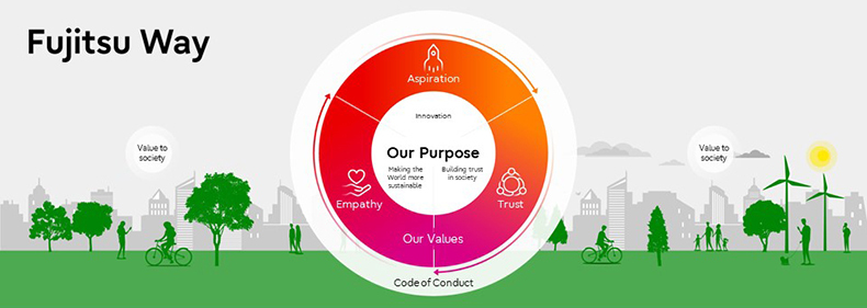 In July 2020, Fujitsu announced that it would transform itself into a Sustainable Transformation (SX) company by defining its purpose to make the world more sustainable by building trust in society through innovation.
――Could you tell me more in detail?
Takahashi: Yes. Until now, Fujitsu has been an IT company that provides technology to help customers succeed in their business.
In contrast, we are transforming ourselves into an SX company that will work together with our customers to promote solutions to social issues by making full use of digital technology. In order to do so, we need to make sure that our various stakeholders understand that stance. That is why we need to showthat the corporate image has also changed in parallel.
――What specific initiatives have you undertaken?
Takahashi: We worked on three main points. First, we have evolved the infinity mark, which is also the symbol of Fujitsu’s corporate brand. This mark, which is also Fujitsu’s DNA, has now a gradation of color to symbolize the company’s commitment to continuous transformation and to connect various topics.
 Infinity mark adopted as the brand identity
Second, various colors were applied to the corporate colors with diversity in mind. Until now, the corporate colors have been red and gray for materials such as customer proposals, web and promotional videos, and internal documents, but we have now changed to a very colorful style. Fujitsu employs 130,000 people globally, and taking advantage of this diversity, business cards, for example, are available in a variety of colors so that each individual can choose his or her own color, and color schemes can be tailored to any theme.
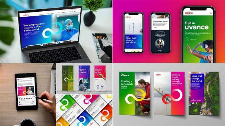 Examples of the Corporate Brand Identity System in use.
Colorful designs are applied with diversity in mind.
Third, the corporate font was designed with accessibility in mind.
The Corporate Brand Identity System emphasizes the importance of providing high accessibility to all people. A good example of this is the development of the new corporate font Fujitsu Infinity Pro.
To enhance accessibility, we developed a corporate font with our own improvements over commercially available fonts to make it easy to read for people with literacy difficulties.
For example, “a” and “o,” “i” and “j,” and “Q” and “O” have similar shapes and can be misread by some readers. In addition to changing such letters to make them easier to distinguish, various considerations have been made, such as asymmetrical shapes for letters like “p” and “q” and “b” and “d” to prevent misreading.
We have also conducted interviews with hearing- and visually-impaired people, and with their input, we have defined guidelines for improving the accessibility of digital content and video subtitling guidelines, which are being thoroughly implemented throughout the entire group.
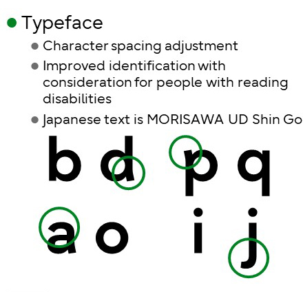 Fujitsu Infinity Pro was designed to be easy to read and familiar to many people
Why was it necessary to review the brand identity now?
Announced new business brand Fujitsu Uvance along with brand identity review
In October 2021, in conjunction with a review of our brand identity, we formulated a new business brand, Fujitsu Uvance, which aims to realize our purpose of making the world more sustainable by building trust in society through innovation. Under Fujitsu Uvance, we have declared that we will strongly promote business focus on solving social issues in order to realize a sustainable world.
Takahashi: The new visual identity was also applied to all relevant design elements, including the logo and font related to Fujitsu Uvance. The new name was also decided by an employee vote, and we have been thoroughly committed to making sure that everyone understands the new Fujitsu.
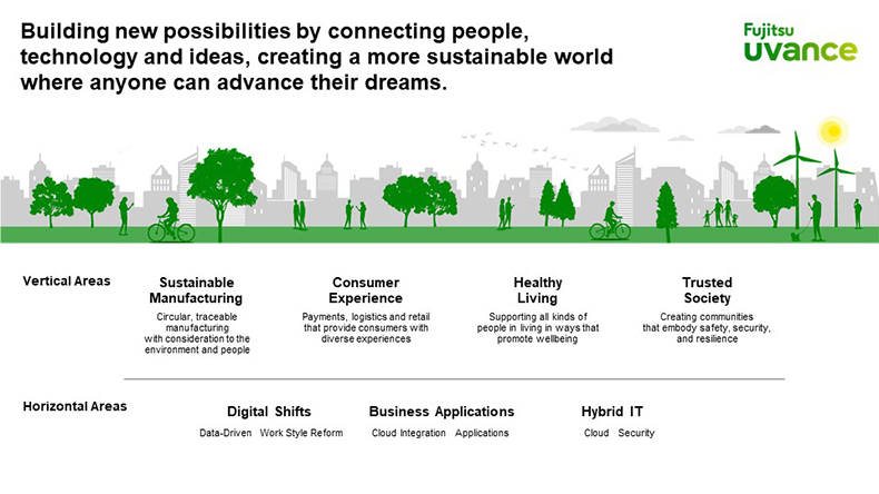 Fujitsu Uvance—a new business brand that represents seven key focus areas
Branding activities are a major step in the challenge for transformation
Regarding the creation of the new brand identity, Takahashi said, “I feel it is a major step at the start of our challenge to become an SX company to realize Purpose,” and continued as follows.
Takahashi: Fujitsu needs to change to solve social issues. We believe that the evaluation we have received in the iF DESIGN AWARD 2022 is an approval from the design industry as a brand identity for a company that takes on the challenge of solving social issues on a global scale.
Logos, marks, colors, fonts, and other design elements that symbolize a company’s brand are visualization tools to communicate with customers in all scenarios. For Fujitsu, they are not merely for identification purposes, but rather as a bond that connects Fujitsu with society and its customers. We hope that society and our customers will recognize this as our commitment to solving social issues and hope to accelerate our future efforts by strengthening our ties in the future.
Fujitsu is committed to working toward the realization of a sustainable world and will continue to engage in business focused on solving social issues with the aspirations embodied in the new brand.

Susumu Takahashi
Senior Manager of Brand Identity & Engagement Dept
Corporate Marketing Div
Global Marketing
Fujitsu Limited


